Weatherproof

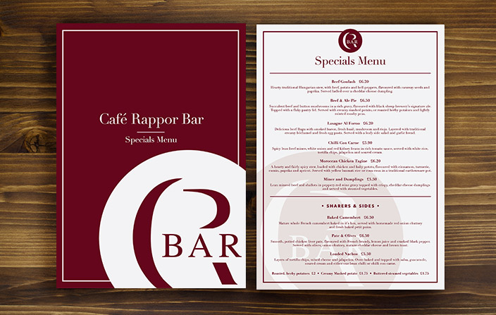
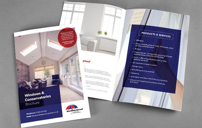
BRIEF | To update their current website and other marketing material.

RESPONSE | Due to their logo being on all of their workwear, vehicles and signage on their building we kept with the heritage and patriotic nature of their current logo and slightly updated it. Taking the colours from the logo we used these across the website and marketing material, but creating a modern edge with a simplistic and clear design.

Cafe Rappor

BRIEF | To recreate their menu’s so that they are more up to date and reflect the quality of the food and service.

RESPONSE | Their old menu’s were a little dated and because of overuse had started to look slightly tattered so the main objective was to update the design and colours and to print the menu’s in a finish that would stand the test of time, and multiple customers handling them. Our response was the matt laminate the menu’s so they were more durable. We also updated the cream and burgundy colour scheme to a light grey and burgundy, for a modern edge.