Advanced Retail Solutions

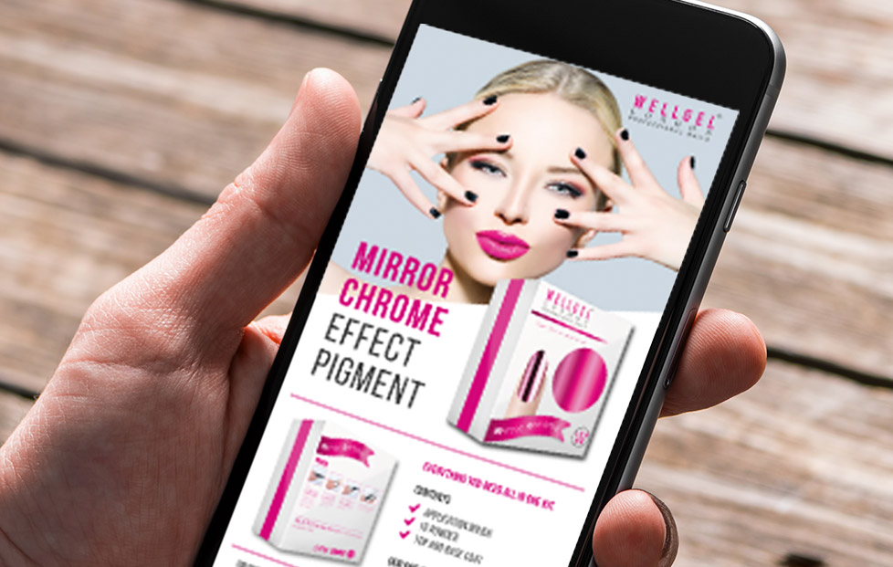
BRIEF | Create a flyer and e-flyer to be distributed to suppliers for their upcoming launch of a new gel nail product called ‘Well Gel’.

RESPONSE | We wanted to create something with a clear message and large image so the supplier receiving the email would be drawn in straight away. The mock up of the box also means the supplier can have an idea of how it will look on their shelves, enticing them to scroll down to the details.

Weatherproof

BRIEF | To update their current website and other marketing material.

RESPONSE | Due to their logo being on all of their workwear, vehicles and signage on their building we kept with the heritage and patriotic nature of their current logo and slightly updated it. Taking the colours from the logo we used these across the website and marketing material, but creating a modern edge with a simplistic and clear design.

Cafe Rappor

BRIEF | To recreate their menu’s so that they are more up to date and reflect the quality of the food and service.

RESPONSE | Their old menu’s were a little dated and because of overuse had started to look slightly tattered so the main objective was to update the design and colours and to print the menu’s in a finish that would stand the test of time, and multiple customers handling them. Our response was the matt laminate the menu’s so they were more durable. We also updated the cream and burgundy colour scheme to a light grey and burgundy, for a modern edge.

Manor Community College

BRIEF | Creating a selection of marketing material to sit alongside their new logo and website.

RESPONSE | Amongst other marketing material, we have recently done a stagecoach bus campaign for Manor, which is currently running in the local area. We have also produced posters, leaflets and a brochure for teachers – creating consistency in their designs across the board.


TelcoSwitch

BRIEF | To make the TelcoSwitch business plan more visually attractive and eye-catching for potential inventors.

RESPONSE | The business plan beforehand was very text heavy and didn’t portray the companies sleek branding. We wanted the business plan to look very polished and professional, but have a personality therefore using iconography to bring certain aspects to life.
We took the turquoise blue from their branding and went with that as our primary colour, using the darker blue and complimentary coral and lime to offset the blue throughout the business plan.

RealTimeTemps

BRIEF | To Design the identity for Real Time Temps, and to design their business plan. They wanted to highlight their USP through the design of both the logo, and business plan.

RESPONSE | We wanted the business plan to look very polished and professional, but also have a personality therefore using iconography to bring certain aspects to life.
We took the orange and grey from the logo and used this throughout the business plan to create a consistent look.
The client was very happy with the output and has plans to use us in the not so distant future.

Falck Safety Services UK

BRIEF | Falck Fire Services required a range of design and marketing to aid in their ongoing marketing activities.

RESPONSE | Falck fire services are a huge global company so we had to follow strict guidelines when designing their brochures, folders, Pull-Up stands and office artwork and various other marketing materials.

The work completed has been very well received by the client and their respective clients.