BRIEF | Creating a new logo for their Gallery to refresh and modernise their existing branding.
BRIEF | Creating a new logo for their Gallery to refresh and modernise their existing branding.
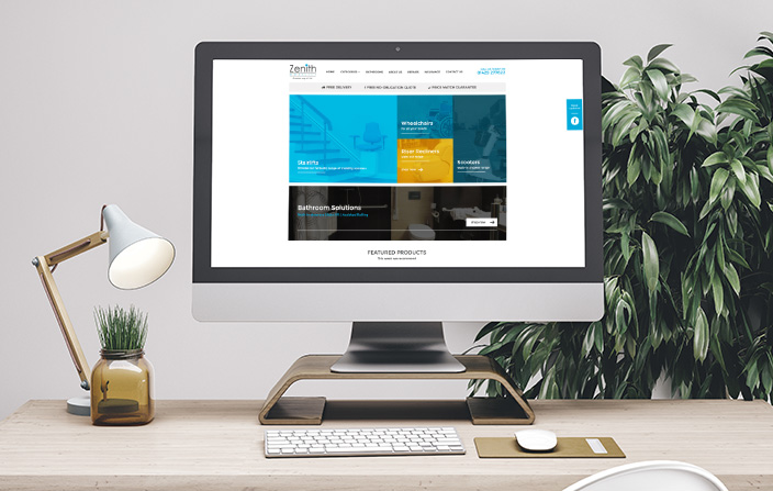
BRIEF | To create a new website. Their old website was looking and working a little old. We wanted to give a fresher and more modern feel to their brand by incorporating colour and a clean minimal design.
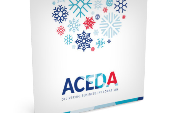
BRIEF | To create a website for Aceda and a selection of other marketing material, including their corporate brochure and yearly Christmas card.
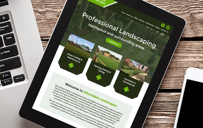
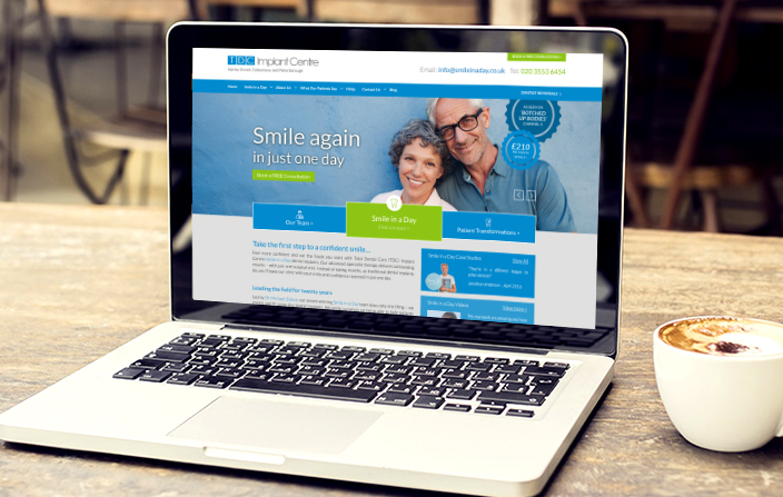
BRIEF | To update their existing website and make it more visually appealing and increase the hits to their page.
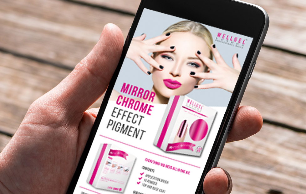
BRIEF | Create a flyer and e-flyer to be distributed to suppliers for their upcoming launch of a new gel nail product called ‘Well Gel’.
RESPONSE | We wanted to create something with a clear message and large image so the supplier receiving the email would be drawn in straight away. The mock up of the box also means the supplier can have an idea of how it will look on their shelves, enticing them to scroll down to the details.
BRIEF | To update their current website and other marketing material.
RESPONSE | Due to their logo being on all of their workwear, vehicles and signage on their building we kept with the heritage and patriotic nature of their current logo and slightly updated it. Taking the colours from the logo we used these across the website and marketing material, but creating a modern edge with a simplistic and clear design.
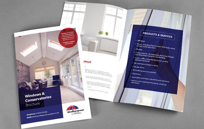
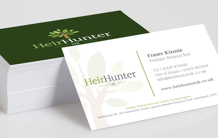
BRIEF | To Refresh their existing brand with a new logo, marketing material and new website.
RESPONSE | Taking the idea of a family tree we created a simple vector icon which became the base for the rebrand. The company wanted to look classy and professional, without looking too formal.
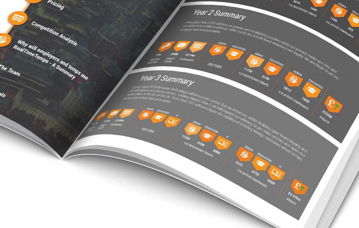
BRIEF | To Design the identity for Real Time Temps, and to design their business plan. They wanted to highlight their USP through the design of both the logo, and business plan.
RESPONSE | We wanted the business plan to look very polished and professional, but also have a personality therefore using iconography to bring certain aspects to life.
We took the orange and grey from the logo and used this throughout the business plan to create a consistent look.
The client was very happy with the output and has plans to use us in the not so distant future.
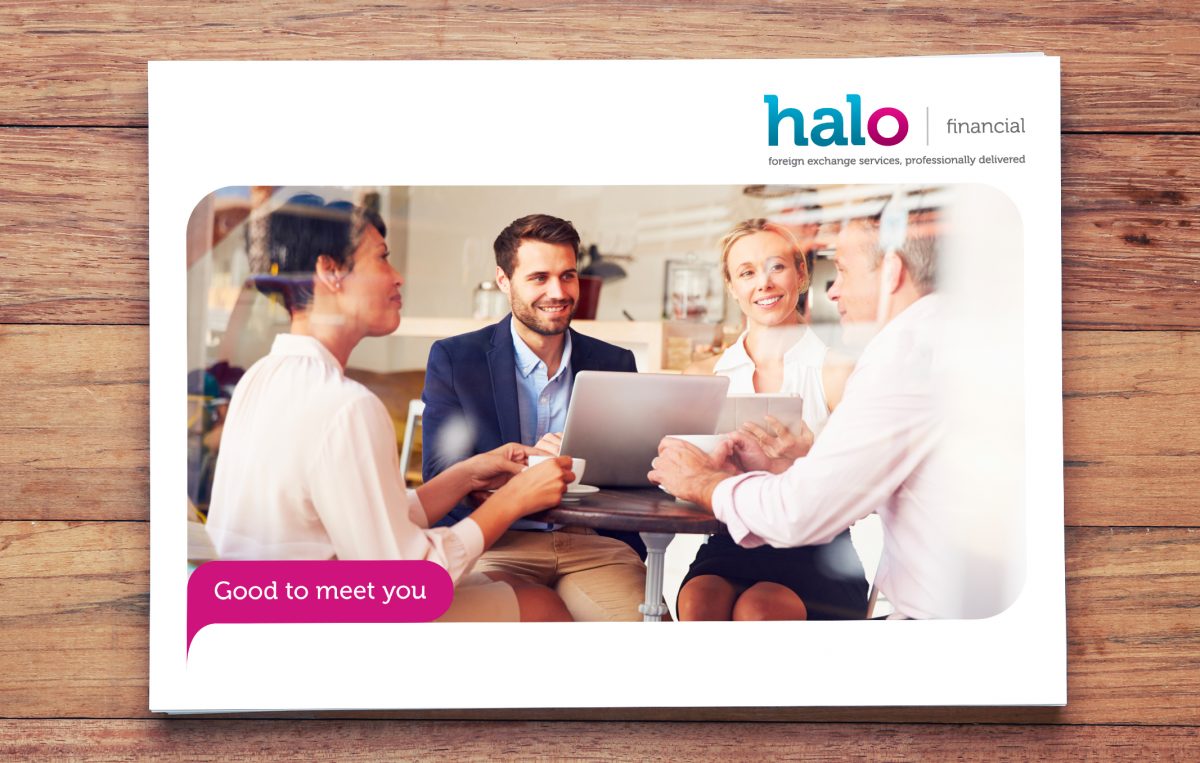
BRIEF | We work with Halo Financial to produce a lot of their marketing material including postcards, infographics for their blog, internal newsletters and animated banners.
RESPONSE | With most of the work we do, Halo like to have an image led design. With the postcard design we used an image that conveyed a more modern scenario.